Medical Website UX Principles That Build Trust and Drive Action
Most healthcare websites win design awards and lose patients. Here is the medical website UX playbook our team uses to turn polished sites into booked appointments without sacrificing compliance, accessibility, or clinical credibility.
On This Page
Most healthcare websites are pretty. Few are persuasive. At Regtek Consulting we have audited many medical practice sites, and the pattern is brutal: design awards do not correlate with bookings. What does correlate is friction. The fewer thinking moments between a worried patient and a confirmed appointment, the better the site converts. This article covers the medical website UX choices that actually move the needle, why most agencies get them wrong, and the design decisions that earn trust before they ask for a click.
Why Medical Website UX Decides Whether Patients Book or Bounce
Medical website UX is the difference between a visitor reading and a visitor booking. Patients are not evaluating your aesthetic taste. They are evaluating whether they can trust you with their health, their insurance card, and their time. At Regtek Consulting, we treat UX as the conversion infrastructure of every healthcare site we touch.
The myth that 'looks good' equals 'converts'
We have walked into pitch meetings where the previous agency built a gorgeous site that barely converted at all. Beautiful is table stakes, not strategy.
Beautiful is not the goal. Useful, scannable, and credible is the goal.
What patients actually scan for in the first 8 seconds
According to Nielsen Norman Group usability research, users decide in seconds whether a site deserves their attention. Patients hunt for: practitioner name, specialty, phone number, location relevance, and proof you are real. Bury any of those and they bounce. Browse our tips & tricks library for more pattern breakdowns from real audits.
If your homepage wins awards but loses patients, do not wait. Schedule a focused UX audit.
Trust Signals Patients Look For Before They Share Personal Information
Trust is earned before the form. Before a patient types their birthdate or insurance number, they need three quiet reassurances: this practice is real, qualified, and accountable. UX choices control all three.
Credentials, affiliations, and board certifications above the fold
Real practice photos vs. stock imagery
Stock images of strangers in scrubs read as evasive. Real photos of the actual lobby, the actual provider, and the actual exam room read as accountable. Patients can spot a smiling-model headshot from a mile away.
Review snippets, ratings, and the placement that earns clicks
Embed three to five recent verified reviews on the homepage and on each condition page. Hide ratings in a footer and you are throwing away social proof at the moment of decision.
Information Architecture That Mirrors How Patients Actually Search
Patients do not search for your org chart. They search for symptoms, conditions, and outcomes. Your navigation should reflect their mental model, not your departmental one.
Symptom-first vs. specialty-first navigation
Specialty-first menus like 'Orthopedics, Neurology, Pain Management' assume patients already know which silo applies. Most do not. A patient with sciatica is more likely to search 'back pain' or 'sciatica' than to navigate by department. A page-per-symptom architecture (Back Pain, Neck Pain, Sciatica, Joint Pain) matches how patients actually Google their problem, which tends to produce more qualified leads.
Internal linking from conditions to treatments to providers
Every condition page should link to the relevant treatments, and every treatment page should link to the provider who performs it. This builds topical authority for SEO and clarity for patients. Our deeper guidance on medical website ux optimization walks through the H1 and meta hierarchy that supports symptom-first IA.
Mobile-First Design: Where Most Medical Practice Websites Quietly Fail
Over 70 percent of healthcare site traffic is mobile, per Statista. Yet most medical sites are still designed in desktop Figma frames and tested on a 27-inch monitor. The result is a quiet conversion leak nobody is watching.
| Pattern | Bad | Good |
|---|---|---|
| Phone CTA | Buried in header menu | Sticky bottom bar, always visible |
| Form length | 11 plus fields with insurance details | 4 fields, the rest collected post-booking |
| Tap targets | Tiny icon-only buttons | Minimum 44 by 44 pixel buttons with labels |
Sticky call and book bars without crowding content
A persistent bottom bar with 'Call' and 'Book' buttons is a pattern that consistently performs well in mobile UX research. Keep it slim, around 56 pixels tall, with strong contrast. Do not let it cover form fields when the mobile keyboard opens.
Form fields, keyboards, and autofill on small screens
Use the right input types ('tel' for phone, 'email' for email, 'numeric' for date of birth digits) and enable browser autofill on name and address fields. For a fuller breakdown, see our list of 7 conversion killers on healthcare sites.

Accessibility as a UX Foundation, Not a Compliance Checkbox
Color contrast and readable typography for older patients
Body type below 16 pixels and contrast ratios under 4.5:1 quietly disqualify a meaningful slice of your over-50 audience. We default to 17 to 18 pixel body, line height 1.6 or higher, and dark slate (#1f2937) on warm white (#fafaf7) instead of pure black on pure white, which causes halation for many older readers. Skip all-caps in long-form copy: it tanks scan speed at any age.
Screen-reader-friendly forms and error messaging
Placeholders are not labels. Every input needs a visible <label> programmatically tied to the field, even if your designer dislikes the look. Inline error text near the field ('Please enter a 10-digit phone number') beats the generic 'Invalid input' that screen readers announce as orphan noise. These same fixes tend to reduce form abandonment for sighted mobile patients too, so the accessibility audit keeps paying twice.
Booking Flows That Reduce Friction Without Breaking Compliance
The booking form is where good design becomes revenue or churn. Every unnecessary field is a chance to lose a patient. Every missing field is a compliance risk. Calibration matters.
Field-by-field decisions: ask later, not now
Ask only what you need to confirm an appointment:
- Name
- Phone
- Reason for visit
- Preferred time window
Confirmation pages that reduce no-shows
A blank 'Thanks!' page wastes the highest-attention moment in the funnel. Use it to confirm what happens next, set expectations on response time, and offer a calendar add. Read our deeper take on medical website ux optimization for the field math behind these decisions.
Visual Design Choices That Reinforce Clinical Credibility
Patients read aesthetic cues as competence cues, fairly or not. A cluttered homepage reads like a cluttered front desk. Visual restraint with one warm human signal tends to beat both stock-photo gloss and surgical sterility.
Color palettes that read clinical without feeling sterile
Surgical blue on antiseptic white signals competence and emotional distance in equal measure. Pair a primary clinical blue (something near #1e4d8f) with one warm accent, muted coral, warm sand, or sage, reserved for CTAs and pull quotes only.
Typography hierarchy that supports skim-reading
Patients skim before they read. Three type sizes is the ceiling, not the floor: a strong H1 around 36 to 44 pixels, H2 around 24 to 28, and 17 to 18 pixel body. Two typefaces maximum, we usually pair a geometric sans (Inter, DM Sans) for UI with a humanist serif (Source Serif, Lora) for long-form condition pages. Anything more reads as design indecision, which patients quietly translate as clinical indecision. For a deeper breakdown, see our analysis of healthcare landing page design: what works above the fold.
Sources
Medical website UX is not decoration. It is the operational system that turns interest into booked appointments. At Regtek Consulting, our digital marketing consultancy team audits, redesigns, and optimizes healthcare sites against the trust and friction principles above, with revenue accountability instead of vanity metrics.
Frequently Asked Questions
What makes medical website UX different from regular website UX?
Medical website UX must reduce anxiety, not just friction. Patients evaluate whether they can trust you with their health, insurance, and time before they evaluate your design. Unlike e-commerce, the decision is emotional and high-stakes, so credibility signals, scannable practitioner details, and clear next steps matter more than visual polish.
What trust signals should a medical website include above the fold?
Show practitioner name, specialty, location, phone number, and proof you are real within the first viewport. Patients scan for credibility cues in roughly eight seconds. Add credentials, a recognizable photo, and accreditation badges. Bury any of these signals below the fold and bounce rates climb sharply, regardless of design quality.
How quickly do patients decide whether to trust a medical website?
Patients decide within roughly eight seconds whether a medical site deserves their attention, according to Nielsen Norman Group usability research. They quickly scan for practitioner name, specialty, phone number, and location relevance. If those signals are missing or buried, visitors bounce before reading a single paragraph of your services or expertise content.
Why do beautiful medical websites often convert poorly?
Beautiful medical websites often convert poorly because aesthetics do not equal persuasion. Award-winning designs frequently bury phone numbers, hide credentials, and prioritize hero animations over patient questions. We have audited gorgeous sites converting at 0.4 percent. Beautiful is table stakes; useful, scannable, and credible is the actual conversion strategy that drives bookings.
What UX mistakes hurt medical website conversion the most?
The biggest UX mistakes are hiding the phone number, requiring scrolling to find specialty or location, using stock imagery instead of real practitioners, and over-engineered booking flows. Patients abandon sites that prioritize design ego over clarity. Each unnecessary thinking moment between a worried patient and a confirmed appointment costs measurable conversions.
How do I know if my medical website has UX problems?
Audit your site by checking conversion rate against industry benchmarks; under 2 percent suggests UX issues. Time how long it takes to find your phone number, specialty, and booking option. Test on mobile while squinting. If you cannot complete a booking task in under thirty seconds, your patients cannot either.
Should medical websites use forms or phone numbers as primary CTAs?
Offer both, but make the phone number visually dominant for urgent or anxious patients. Forms suit non-urgent inquiries and after-hours leads; calls suit symptomatic patients ready to book. Sticky headers with click-to-call on mobile typically outperform form-only designs. Match the CTA to the visitor's emotional state, not your operational preference.
Ready to see results for your practice?
30-minute strategy call. Direct access to Kevin Dillon, an operator who's scaled healthcare businesses to Inc 5000. No account managers, no pitch deck, just answers.
Book a Free ConsultationMore Tips & Tricks
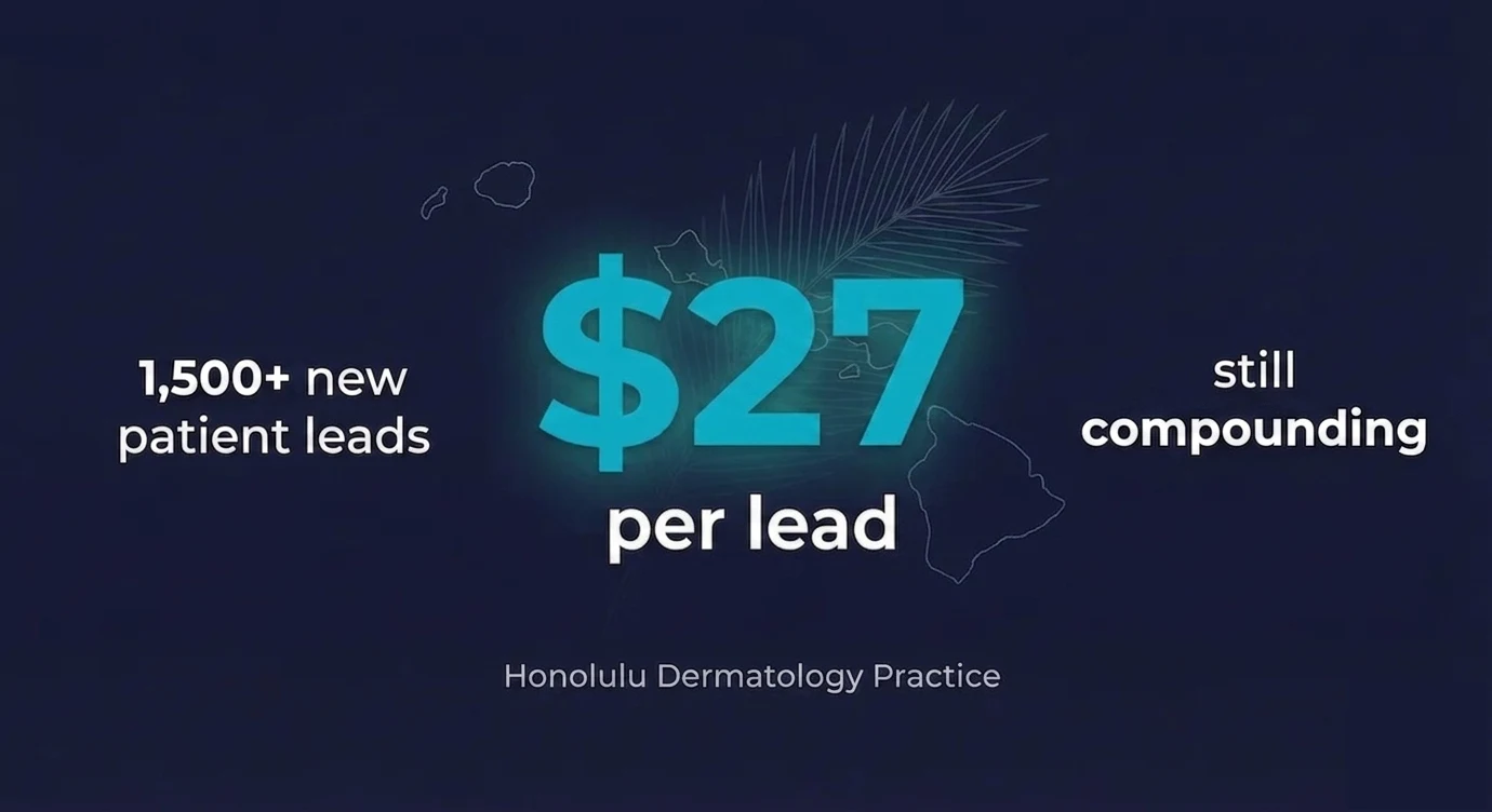
What Should Dermatology Leads Cost? How One Practice Achieved $27 Per Lead
Dermatology lead cost is one of the most common questions practice owners ask about Google Ads. Are you overpaying? Is there room to improve? Or is this just what patient acquisition costs these days? Here’s a real…

Healthcare CRO: Turn Visitors Into Booked Patients
Healthcare websites typically convert just 1.5% to 3% of visitors, while top performers hit 6% to 12% on identical traffic. This pillar guide shows exactly where the gap lives and how to close it.
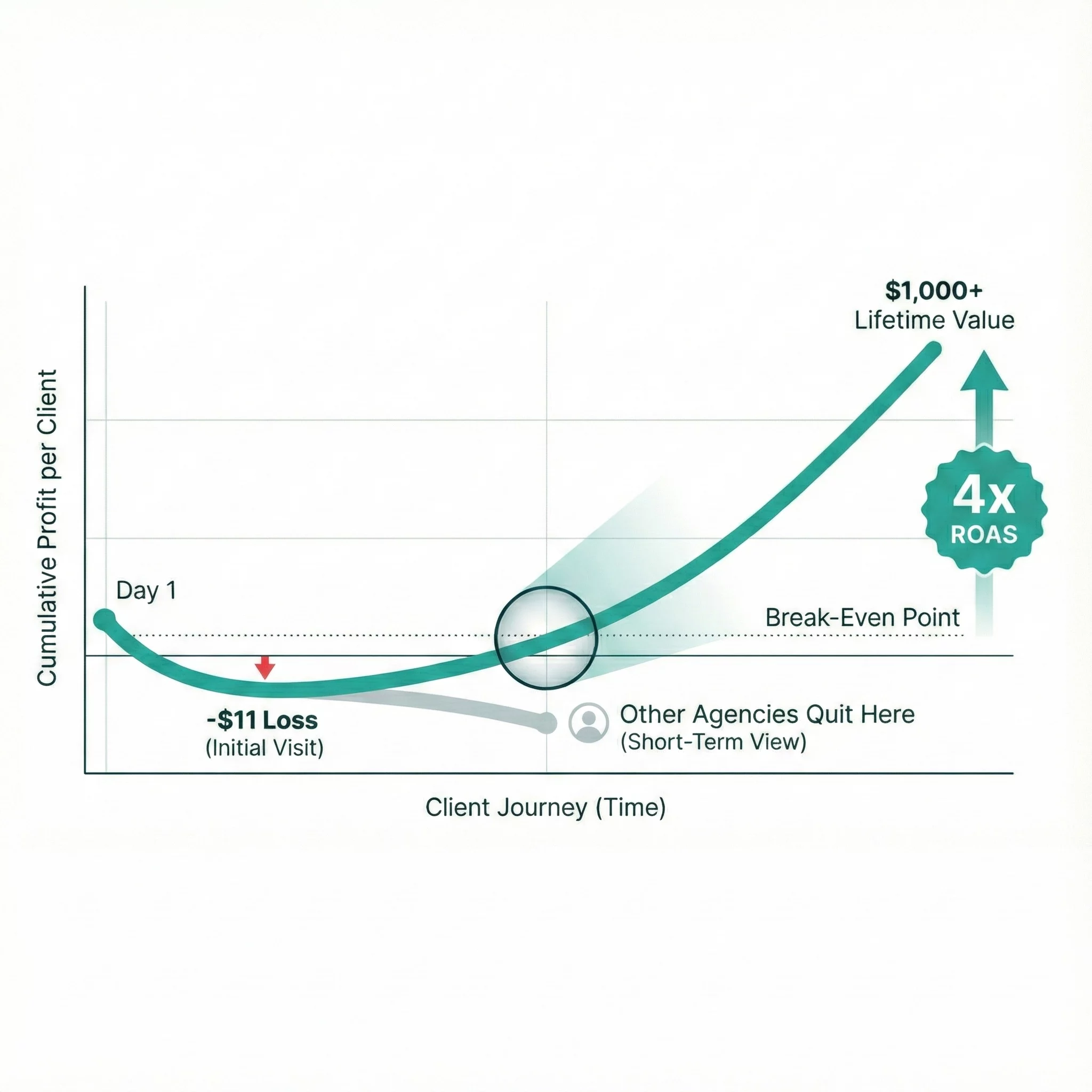
Medical Spa Marketing ROI: How One MedSpa Hit 4x ROAS by Tracking Lifetime Value
Most conversations about medical spa marketing ROI start and end with cost per lead. When Menon MediSpa in Millburn, NJ came to us, they’d already learned why that’s a problem. They were getting results with certain…